Learn how to use colour strategically in design to influence emotion, guide user behavior, and create a consistent, high-impact brand experience.

July 28, 2025
Boost your visual impact with strategic colour choices
Colour isn't just decoration — it's a design tool that communicates mood, builds brand trust, and influences action. In this guide, you'll learn how to use colour effectively across your brand or website using proven design strategies.
Understand how people emotionally react to colour
Colour impacts how people feel about your brand — sometimes instantly. Here are common emotional and psychological associations tied to popular colours:
Structure your design system for clarity and consistency
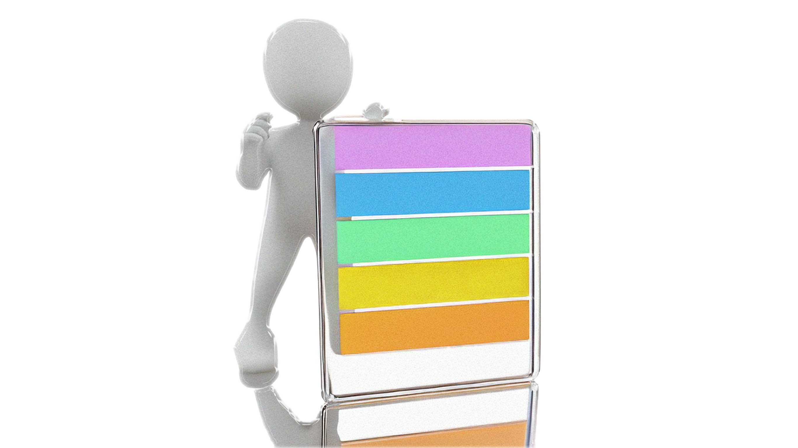
A reliable colour system helps create consistency across your website or brand assets. Here's a practical structure to follow:
💡 Use tools like Coolors.co or Adobe Color to create web-friendly palettes.
Apply colour to direct attention and improve UX
On the web, colour tells users where to look — or click. Use it to create a visual hierarchy:
Don’t forget accessibility. Maintain strong contrast ratios (4.5:1 or more) for readable text.
Print, digital, and screen modes all need harmony
Colours display differently across screens and formats. Use these settings to keep colours consistent:
Pro tip: Add global colour swatches in Webflow so you can update a colour across your entire site instantly.
Trendy colours come and go — your brand is forever
While colour trends (like pastels or neon gradients) can add freshness, don’t let them override your brand’s voice.
Use A/B testing and analytics to find what works
Even small colour changes can affect conversions. Try:
Track performance metrics and adapt your palette for better results.
Whether you're launching a website, rebranding, or creating content, colour plays a major role in user perception and performance. When used strategically, it enhances experience, builds recognition, and drives results.
Crafting designs with meaning.
Thinking creatively, staying in mode.
© 2025 CREATIVEMODE STUDIOS. All Rights Reserved.